The baseball field in GameChanger’s scorekeeping app is one of the core parts of our user interface. In this post I’m going to describe how it has evolved over time and how it was rebuilt to support both the new range of iOS devices that Apple has released in recent years and whatever new screen sizes might come in the future.
The First Baseball Field
When the GameChanger app was released for the iPhone, iOS devices only came with one screen size which made it easy to design and build our baseball field. We used a single png file as a background image and all the buttons and interactive elements sat on top of that. This image had all the complex shapes and textures needed to represent a realistic baseball field. It was the foundation of our scorekeeping UI, and every other element like the runners, defensive players, and bases were designed to match the field on that png file.
This approach worked very well for a few years. New generations of iPhones continued to use the same screen size, so we were able to keep using the same image for our baseball field. Some features like spray charts (a graphical representation of the location of every hit in the game) became closely tied to the original png. If a ball was hit to second base then it would get registered as happening on the coordinate where second base was on the original png image.
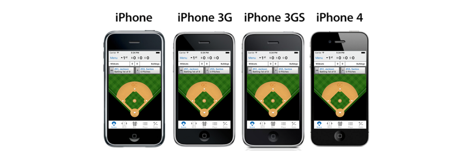 Original field image
Adapting for the iPad and iPhone 5
After Apple released the first iPad, GameChanger made the decision to make the app universal, meaning that the same app could be installed and used on both iPhones and iPads. To support the larger screen, a second field png was created. It was larger than the iPhone version and the proportions were a little different to fit the new aspect ratio. By this point we already had hundreds of thousands of game events scored using our iPhone app, which made changing our game data’s coordinate system impractical. Instead, we used a transformation that allowed us to convert every point from the iPad field to the iPhone’s coordinate system and back.
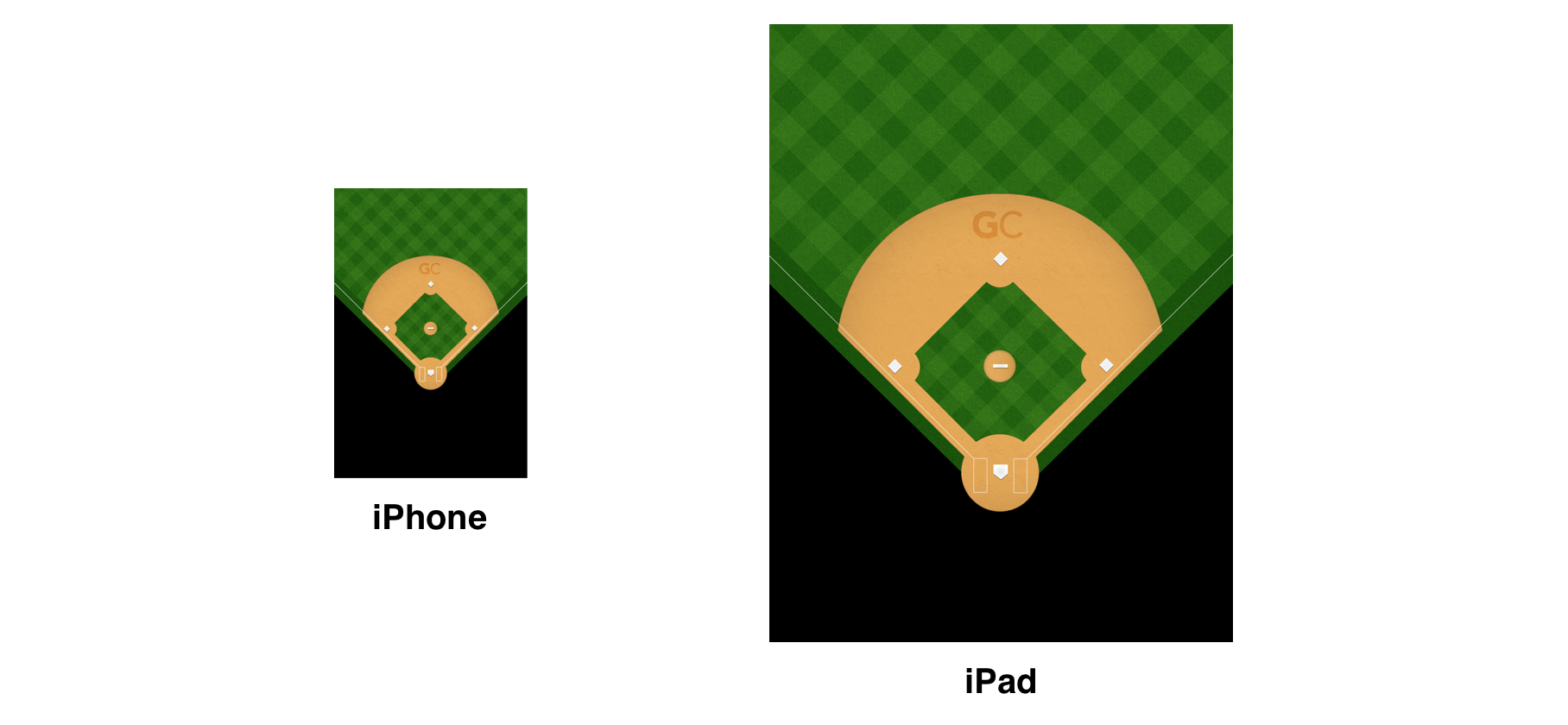 iPad field image
A couple years later, in 2012, Apple introduced the iPhone 5, with a screen a little taller than the previous one. We handled this by replacing the old iPhone field asset with a new version that was a little taller as well. In the iPhone 4, the image would be clipped so that some portion of the bottom and top of the png would be hidden below the navigation and tab bars. In the iPhone 5 the whole asset would be shown, and a small vertical translation would be applied to each play that was scored so that it matched all of the existing spray chart data.
 4 inch screen field image
All The New Sizes
In 2014 Apple announced the iPhones 6 and 6 Plus, which meant that there were two new screen sizes with different aspect ratios coming onto the market. In addition to that, rumors of side by side multitasking coming to the iPad were beginning to gain strength and were later confirmed in 2015. A few months after that, the iPad Pro with a significantly larger screen was announced. All of these announcements in combination meant that the total number of screen sizes in which an app could run grew from three to over seventeen in a very short period of time.
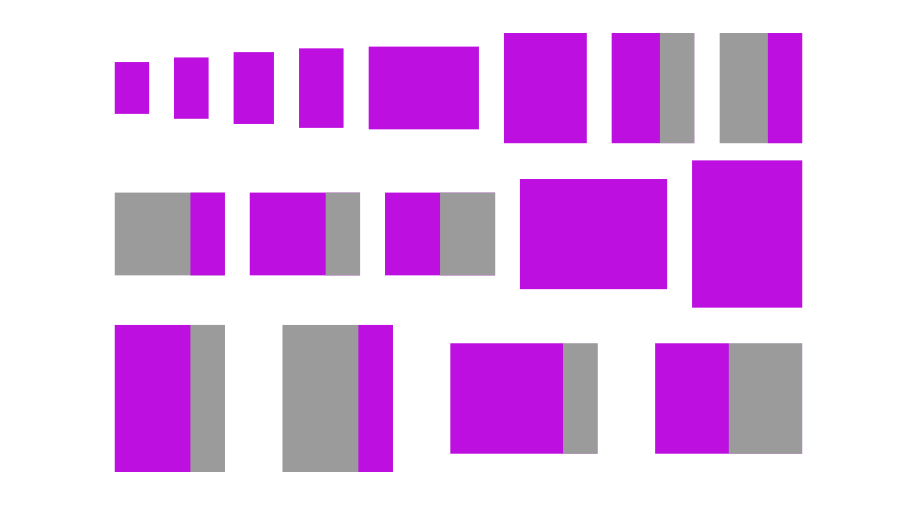 Possible app execution sizes in current iOS devices
When we started working on fully supporting the new iPhone screen sizes it became clear that our strategy of using a png asset as the background of our field and then transforming coordinates to match the original iPhone wasn’t going to work anymore. One of the main reasons was that doing so would have meant a large increase in the download size of the app. If we needed up to eighteen high quality assets for each sport (baseball and softball fields look slightly different), and some of these would need to be created in 1x, 2x and 3x sizes, the app bundle size would need to grow significantly. This is a big problem because it makes it harder and more costly for users to download our app on a cellular network. If the app happened to grow over 100 MB, people wouldn’t have been able to to download it without WiFi. We were not very far from that limit.
By this point we had also realized that Apple was not sticking to less than a handful screen sizes any more, and the prospect of having to rework the field and implement a new coordinate transformation each time a new device type was released wasn’t appealing. In addition to that, the fact that even minor changes to the look and feel of our field meant that our design team would need to create around 30 different assets to support every possible screen size and resolution made it feel like continuing to use static images would incur a high amount of technical debt.
We decided that the solution would be to abandon the static image strategy and make a field that could be dynamically drawn on any rectangle, independent of its size and aspect ratio.
The Grid
We started by defining an abstract coordinate system that would be independent of any specific screen size by dividing our field into a grid that matched our legacy field’s aspect ratio. Each square in that grid has a height and a width equal to a grid unit. We then assigned a position and a size to every element in the field using this coordinate system and grid units. Coordinates are defined as decimals so elements can be positioned inside grid units.
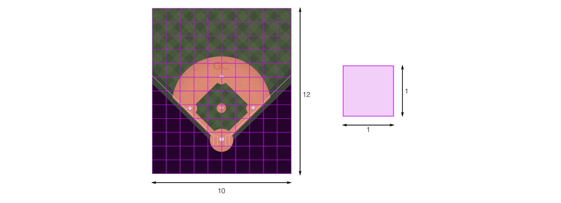 Grid and grid unit
With coordinates and locations for every element in the field, we just need to find out what the largest possible grid that we can fit on any given rectangle is. Whatever remaining space we just distribute equally horizontally or vertically depending on each case, and fill with empty space or extra grass later when drawing.
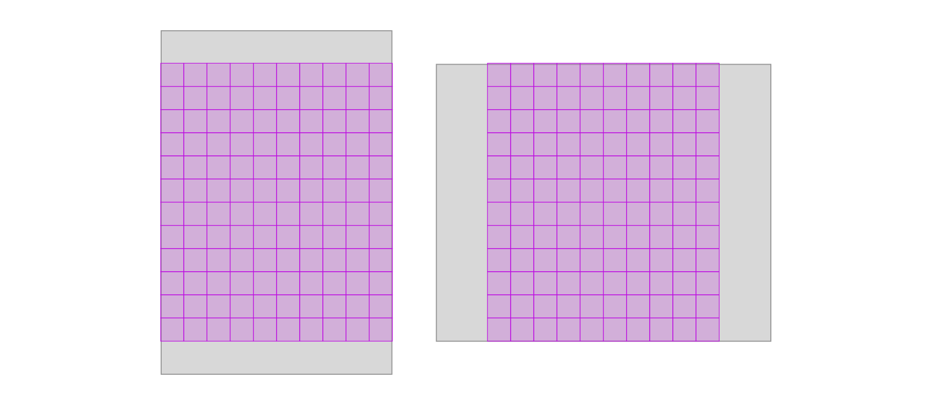 Largest grid calculation
Then we can use that size to calculate what the size of the grid unit is in pixels for any given rectangle, and transform every coordinate and size from the grid unit coordinate system to the coordinate system of the view that contains the field. The transformed values is what we then pass to the graphics libraries in iOS to draw each of the layers and elements.
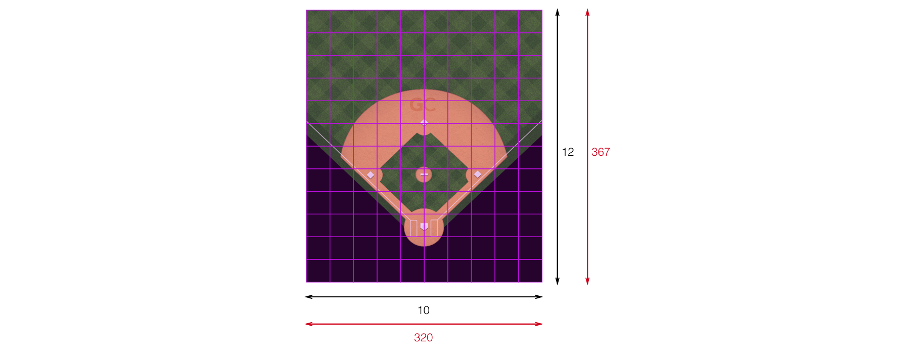 Coordinate transformation
The Layers
When we have a transformed value for every point and size in pixels, the actual drawing begins with the help of CAShapeLayer and UIBezierPath. These two classes together allow us to create layers that have any shape that we define. Each layer can have its own background and path, which is very useful to build the complex composition of shapes and textures the field needs. In addition to that, layers can take a CGImage as a background color and use that as a pattern, which was useful for the sand and grass patterns. The bases were drawn on a regular CALayer using images that get sized proportionally to the grid unit.
Making the required modifications for the softball field was a very simple task: we just needed to remove the infield grass layer and add a layer with the circular line surrounding the pitcher’s mound.
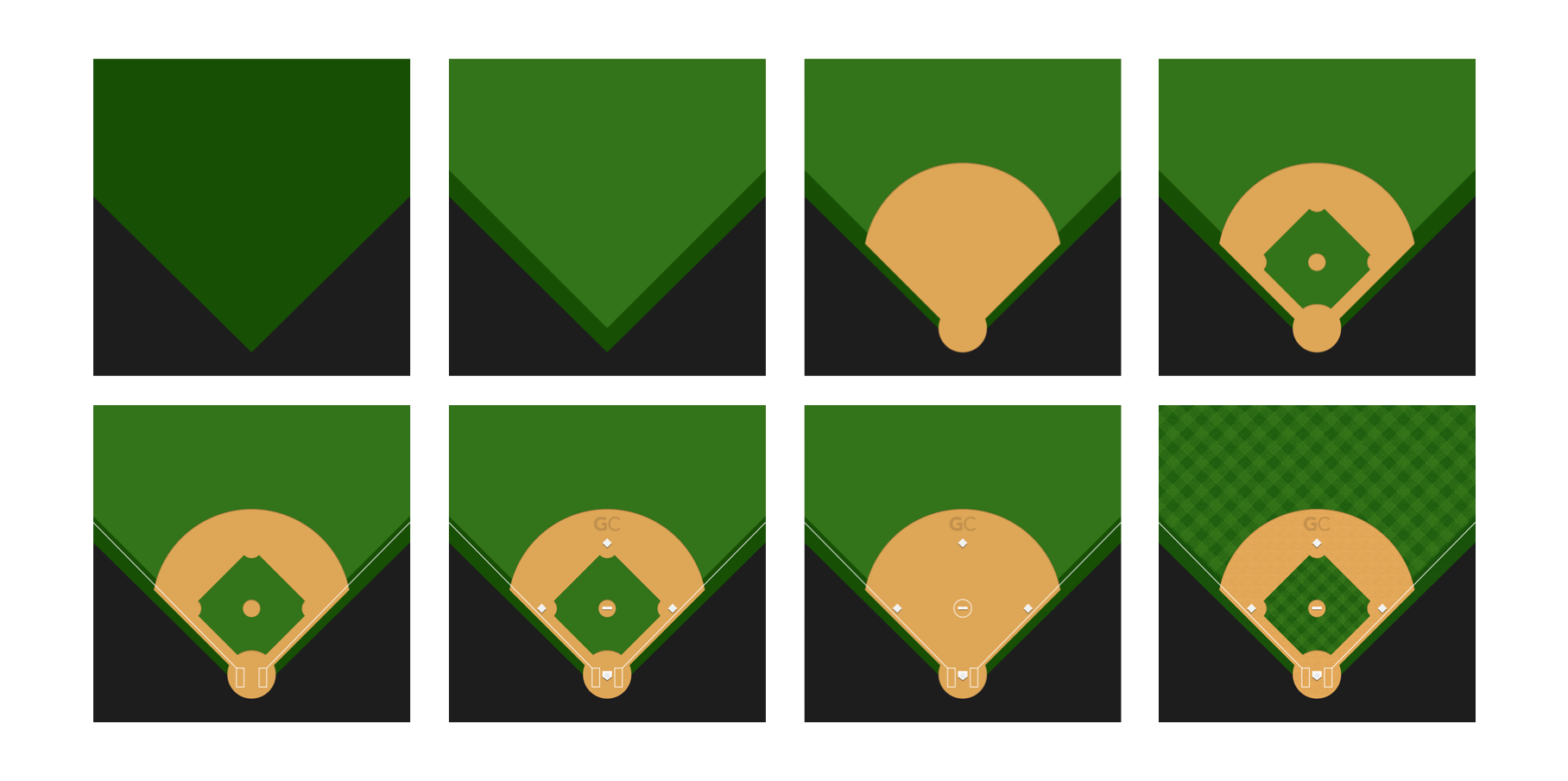 Layer composition
Conclusion
This project met our goals of reducing the complexity of having a field that could be properly drawn on any screen size. Having an abstract grid allowed us to define every location and dimension based on it, and then transform them to a rectangle of any aspect and pixel size, while preserving consistency with our historical spray chart data by having a transformation to our original coordinate system.
Doing this also had other positive consequences. We were able to reuse the same field view that we used on scorekeeping for displaying spray charts with only a few minor aesthetic changes. Removing both the spray chart background assets and the scorekeeping field assets, and converting some of the images to pdf vectors ended up reducing the downloadable size of our app by about 32 megabytes, which means it’s less costly for our users to download our app on a cellular network.
When this project began there were only rumors about a possible iPad Pro. After it was released some parts of the app needed to be adjusted for the bigger screen size, but the field required no work whatsoever so we’re already starting to see the benefits of having a baseball field that can adjust to any screen size.
Whenever we have to develop new UI components in the future we will try to use the learnings from this project and use similar techniques from the start to make sure they can be easily scaled to any screen size that might come in the future.