
Have you ever participated in a firefight where the root cause seems unclear, then suddenly the symptoms self-resolve? Sometimes inadvertent action may cause it, other times it appears miraculous. If you find yourself in this situation, or excusing recovery with “it was a one-off blip,” your system likely lacks sufficient observability. With development and operations increasingly converging, application instrumentation continues to concern many teams building new platforms and maintaining legacy ones.
The general rule of thumb when introducing observability into a system is to instrument everything. However, this philosophy creates a user experience challenge. How do we deliver the salient system correlations to the people who can best leverage them? The platform team at GameChanger recently had the opportunity to tackle this question when we encountered performance degradation while scaling a new back-end system. We are not yet finished, but we have progressed meaningfully.
Diving into the black box
Modern Node.js, using async/await with Koa, powers GameChanger’s nascent Team Manager product. PostgreSQL serves as the primary datastore and PgBouncer manages connection pooling to the database. We already use Datadog to monitor many of our legacy systems. Starting with Datadog for a new system made sense for a number of reasons:
- Vendor familiarity: engineers already understand the operational model and where to look for diagnostics
- Breadth of functionality: support for a wide variety of metrics, application performance monitoring (APM) and centralized logging, and mature monitor types, ensure our telemetry can scale alongside the codebase
- Low adoption cost: integrating new services with our existing Datadog configuration is trivial
After building an MVP, our baseline instrumentation included typical system level metrics, such as load average, CPU utilization, and used memory, as well as custom metrics for all requests like duration and status code. Such metrics enable us to monitor attributes of user impact like error rate and response time. We also had the ability to selectively time function calls, but no meaningful way to create correlations such as flame graphs. Lastly, we use Loggly for log aggregation, but constructing a timeline from logs and associating them with behavioral trends we might encounter in Datadog remained challenging. These mechanisms provide robust insight horizontally; we can see behavioral patterns in a cluster from the data we categorize. However, once we identifed problematic requests, we had little transparency vertically, such as the time database or third party network calls consumed during the request.
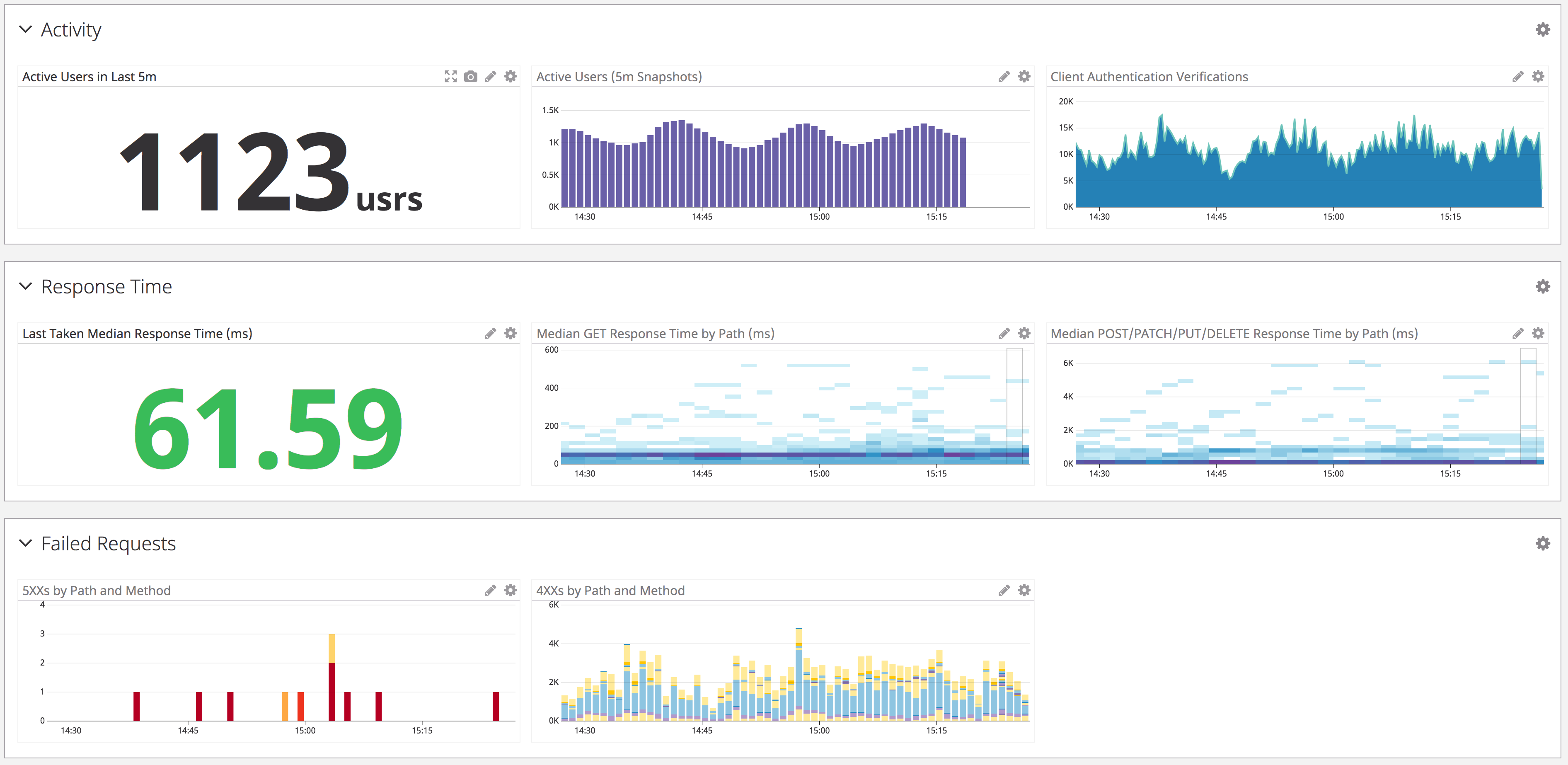 A sample of graphs from one of our dashboards. We categorize similar classes of metrics in order to reduce cognitive overhead during diagnostics.
As our active user count increases, we continue to add new functionality to the application. In the initial design, we had clear intent behind some of the architectural patterns, but only hypotheses about whether these patterns would achieve our goals. Additionally, GameChanger’s engineering culture encourages team members to work across the stack and contribute to codebases and systems in which they might not be experts. These practices stimulate learning and technical growth. However, when intersecting with a new codebase, testing performance and scalability hypotheses becomes problematic.
In order to refactor both incrementally and holistically, while maintaining a high velocity of contributions, we wanted to augment how we gather information to inform decisions. On the people side, we formed a decision-making committee from members of many contributing teams. This committee conducts research and effects architectural change in the system. On the technical side, we sought to empower engineers to more easily identify performance bottlenecks using instrumentation. In order to do this, we outlined a few requirements:
- Distributed correlations: provide a comprehensive view of how all of our components, e.g. Memcached, Redis, AWS Simple Queue Service (SQS), in addition to PgBouncer and Postgres, interact within the lifecycle of a request
- Granular tracing: expose as many details around timing as possible, from individual function calls to low level framework operations such as the Node.js event loop and garbage collection
- Extensibility: extending this monitoring with new additions to the codebase, whether it be new endpoints, new providers, etc, should demand minimal effort
- Stretch: zero-touch installation: avoid requiring changes to application code in order to surface useful metrics
Surfacing with clarity
Two significant bugs in our system surfaced recently. In hindsight, tools fulfilling such requirements would have revealed the root causes more quickly. The first bug was a mistake in some ORM code, where some requests executed redundant SQL statements orders of magnitude more than they should have. The database handled the load well, yet the I/O-intensive activity caused thread starvation in the Node.js worker pool and we witnessed widespread request timeouts. In this case, we had attempted to correlate Node.js requests to PgBouncer waiting client connections to Postgres transaction throughput. However, without vertical visibility into each request, each component appeared relatively stable in isolation.
The second bug was a design flaw in our workers that process SQS queue items. In a loop, workers either perform queue tasks or short poll SQS to determine if items need processing. The polling frequency for empty queues triggered AWS rate limiting. Combined with our exponential backoff response, we witnessed delays in all workers, regardless of queue length. Thus, empty queues cannibalized the throughput of populated queues. In this case, we had no monitoring on our SQS network calls and debugging was an archaeology exercise.
To try making some of these bugs easier to diagnose, we turned to APM solutions as a panacea fulfilling many of our requirements. While typically installed on a single application, APMs provide granular tracing and can infer interactions with external services by treating them as a black box. We evaluated both Datadog’s and New Relic’s solutions. Each supports Node.js out of the box and is relatively straightforward to install with minimal application code changes. Much to our delight, New Relic provides detailed instrumentation of Node.js internals, exposing metrics on the event loop, memory usage, and garbage collection. Additionally, both services trace request operations, correlating insights from database to external service activity. Yet both solutions had varying support for Koa at the time of adoption. Datadog only recently introduced support for Koa, and New Relic required some manual pattern matching of routes.
Aside from those features, we mostly found both services functionally equivalent. We chose Datadog for its superior user interface, familiarity with the platform, and ease of integration (at the cost of vendor lock-in). Datadog provides a more refined web application for browsing traces, and their query DSL is simple and intuitive. Finally, the ability to export trace searches to our existing alerts and dashboards made extending our existing, monitoring coverage trivial.
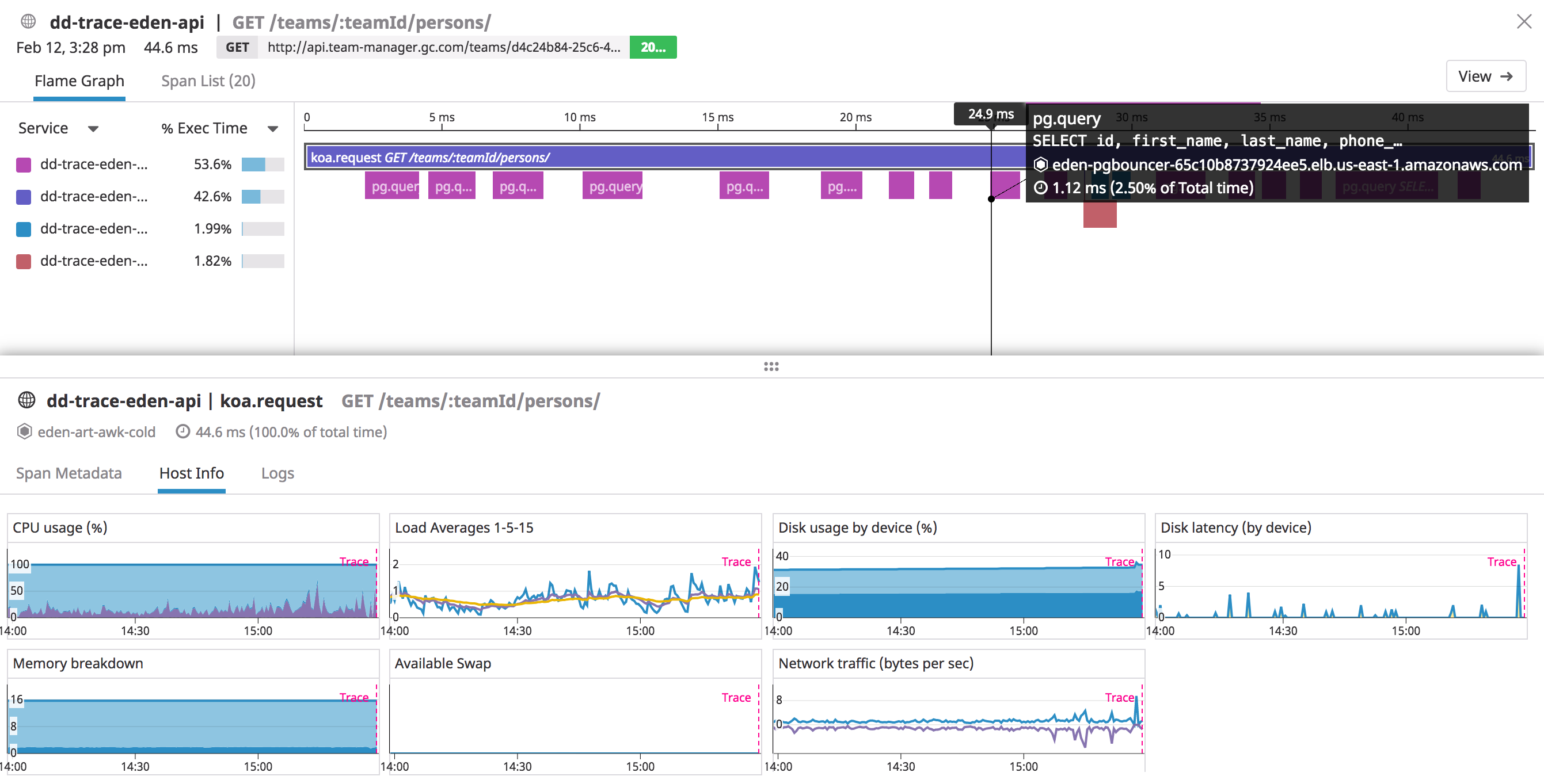 Datadog traces supplement flame graphs with host metrics and provide optional, logging integration.
Revisiting the bugs we previously discussed, we now have observability into:
- SQL statements executing during a request, allowing us to identify excessive database activity
- Duration of external asynchronous operations, enabling us to monitor outlier slowness
While we still lack sufficient observability into Node.js internals with Datadog, we enabled granular, distributed tracing with relatively low overhead. The automatic route matching and support for many common frameworks and libraries in their APM ensures low effort to maintain quality instrumentation as we extend the application with more endpoints and service integrations. The vertical observability of individual requests and API operations supplements the horizontal observability from existing dashboards and graphs. In practice, we still rely heavily on dashboards and graphs to illuminate behavioral trends of dependent components in a system and explain what is happening. APM now brings us closer to potentially answering why such things happen.
On the horizon
While implementing APM reaped many rewards for us, we still have outstanding concerns. For example, we lack the ability to correlate API HTTP requests to PgBouncer TCP connections to Postgres transactions, which might make it difficult to tune connection pooling strategies. Our logs remain segregated from our monitoring and are impossible to analyze across attributes with high cardinality. Connecting monitoring to the teams best positioned to act upon them continues to challenge us.
We briefly considered alternative approaches to instrumentation (not necessarily mutually exclusive). Envoy Proxy appeared on our radar as a solution for monitoring at the network level and also fulfilled our zero-touch installation requirement. Honeycomb.io also intrigued us for its approach to observability primitives and ability to generate many insights from raw data structures. Ultimately, APM provided the most value for effort given the prior state our system, but it would be interesting to explore such options in the future.